
Brand strategy, visual identity, and packaging direction
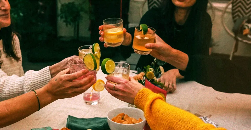
A good drink gives people a reason to gather. Stir Sessions makes that part easy: powdered cocktail and mocktail mixers, ready for whatever you want to pour. The ambition was to build a brand that belonged to the time spent together. Friends around a table. A weekend away. An afternoon that turns into an evening.
I worked on the brand strategy, visual identity, and packaging direction, giving a new brand a point of view before its first introduction.
The challenge
Craftmix and Batchwell were the competitive references for the project. Convenience and good ingredients are familiar promises in this category, and both brands make room for the social side of drinking. Stir Sessions needed a recognizable character within that shared territory.
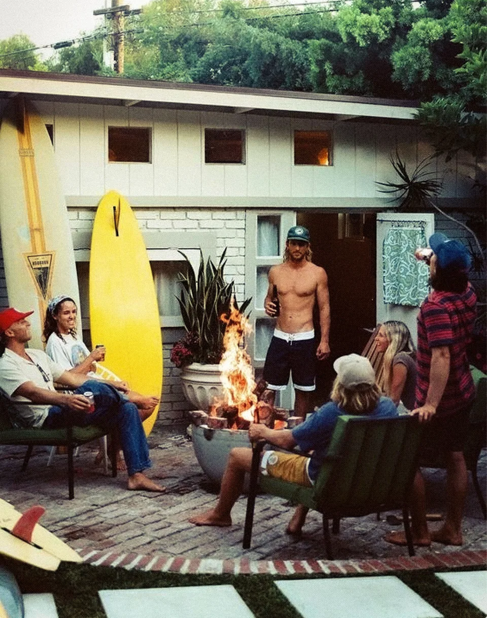
The platform centered on people who value friendship, family, travel, and the small pleasures that fit between everything else. The product could come along for those moments. Alcohol was optional; the invitation to join in was built into the idea.
That gave the work a useful question to answer: what would make a powdered mixer feel at home among the things you bring out when friends come over?
Visual identity
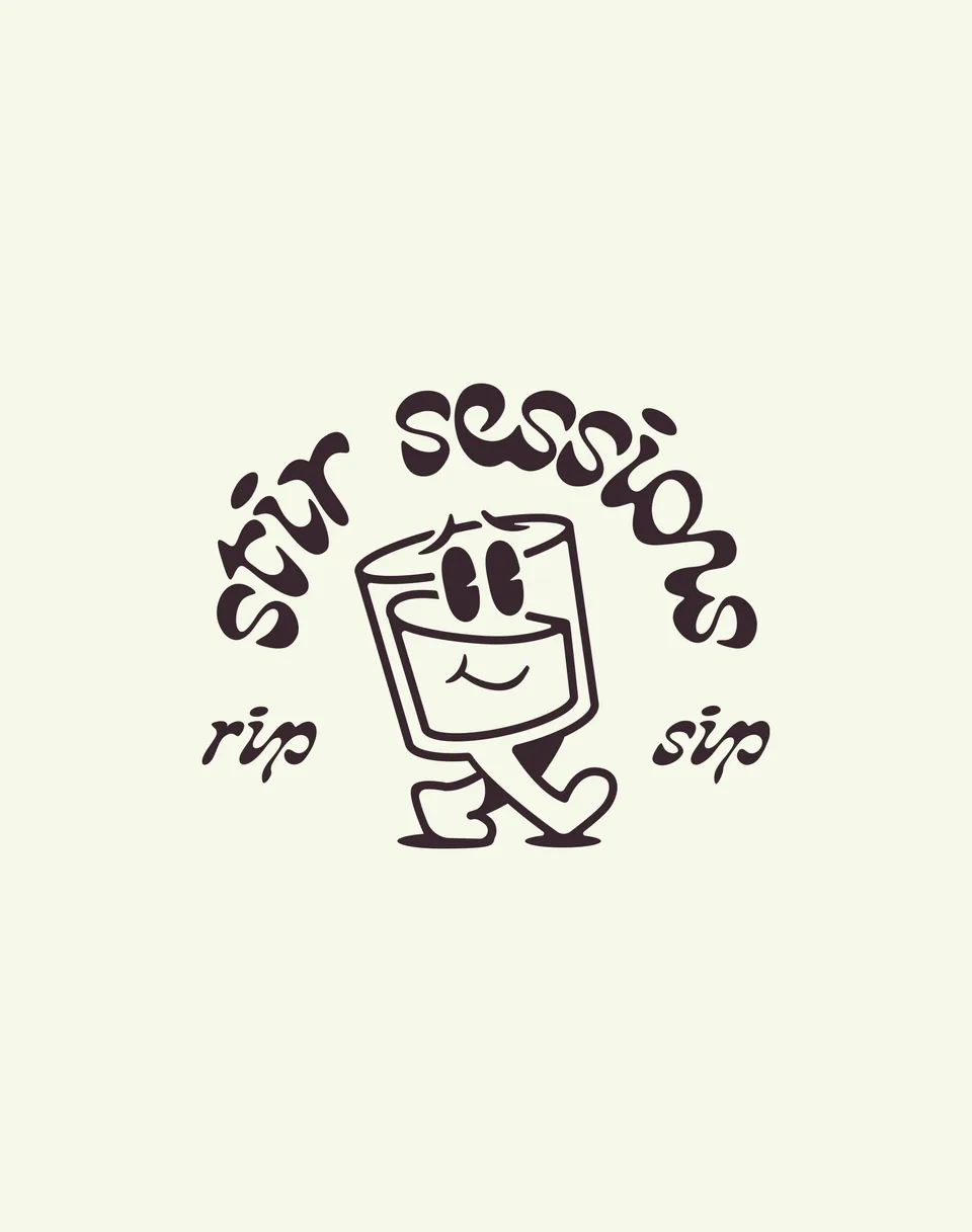
The lettering is flowing and slightly unruly. Its slant gives the name movement, while the uneven forms keep it from feeling too polished. The stacked wordmark has enough presence to hold a package; the horizontal version leaves room for the character to walk right through the name.
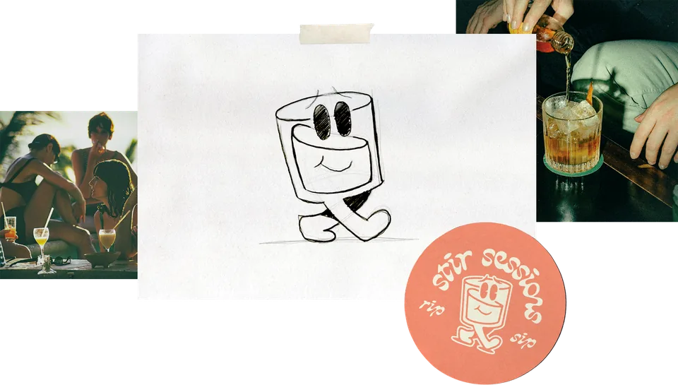
That smiling glass gives the identity someone to recognize. It brings a small dose of humor to the system and works inside a badge, beside the lettering, or on its own. A drink with somewhere to be.
The personality comes from the relationship between those pieces. The lettering has swagger. The character makes it friendly.

Strategic direction
We built the platform around connection and ease. The voice would be warm, positive, and approachable. The personality needed some edge, with enough sophistication to feel considered and enough looseness to make people comfortable.
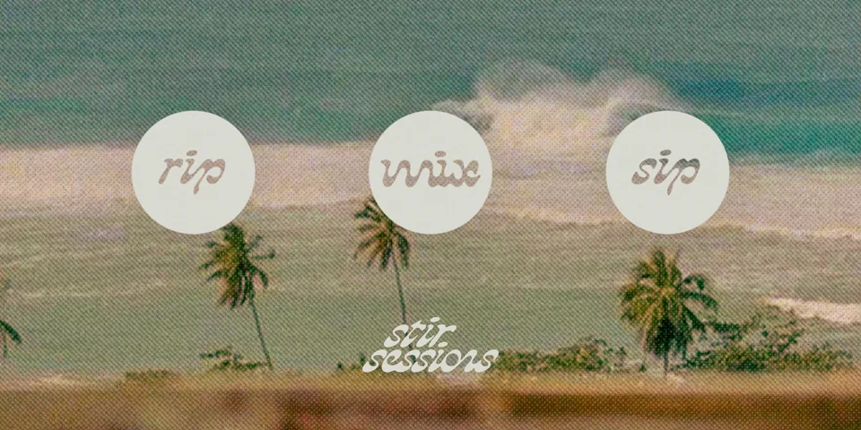
Nostalgia gave that direction a visual starting point. Records, familiar places, a drink shared outside. The references suggested a life around the product, with room for music, adventure, and a little mess.
I wanted the identity to have that same ease. Something with character that could sit comfortably at a backyard gathering. The design needed to carry the feeling before anyone read the positioning statement.
That balance mattered across the whole system. A headline could be cheeky, a character could be playful, and the instructions still needed to be easy to follow.
Color palette
Color took some work. The palette needed to stay tight enough to hold the brand together while giving a variety of flavors their own expression. Each new flavor had to feel distinct and still belong to Stir Sessions.
We expanded the palette beyond the initial style guide as we worked through that range. The challenge was keeping the family recognizable as it grew.

Packaging direction

The packaging concepts put that range to work across Old Fashioned, Classic Margarita, Espresso Martini, and Mojito. Large lettering leads, with color establishing variation and the badge adding another recognizable detail.
The direction extends from larger pouches to individual sachets, where the circular character mark takes a more central role. The layouts demonstrate how the same elements can change emphasis as the available space changes. These are packaging concepts, developed to guide application of the identity.
The outcome
The delivered platform and style guide gave Stir Sessions a common reference for its voice, identity, and packaging. The team had a set of elements to work with and a reason for how they fit together.
For me, the useful test is whether those decisions still point back to the original idea. A good drink. A few friends. Enough character to earn a place at the table.
Let’s talk
and build the brand with care from the start.