

Brand identity + creative direction
The sustainable personal care aisle had become visually predictable. Soft colors. Gentle typography. Earnest language about doing better.
Everything looked responsible. Very little felt distinct.
The challenge
Canary saw an opening. They did not want to participate in the polite aesthetic that had come to define "clean." They believed sustainability could feel active and engaged, not muted and careful.
At the same time, they were building products for real households. Adults and kids. Shared bathrooms. Daily routines.
This created a real tension.
Push too far into rebellion and lose families.
Soften too much and become invisible.
The brand needed to feel opinionated without feeling niche. Playful without feeling trivial. Serious about waste, but at home in everyday life.
Strategic insight
The problem was not simply aesthetic. It was cultural.
Many eco brands speak from a place of moral distance. They signal virtue. They imply correction.
Canary did not want to correct people. They wanted to invite them.
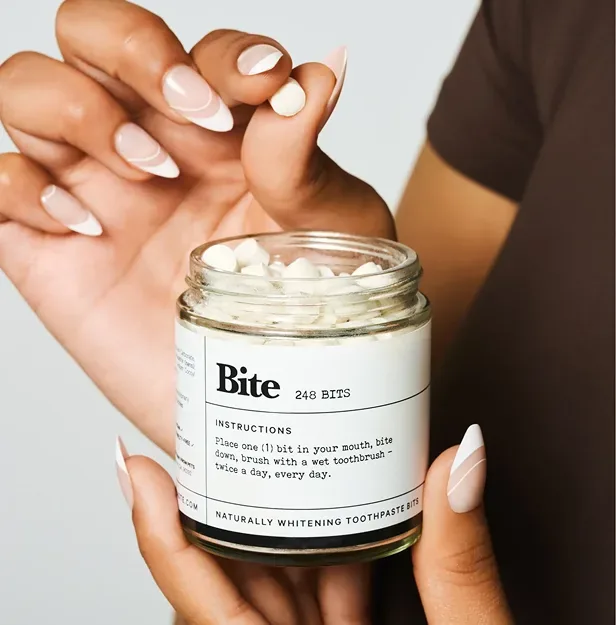
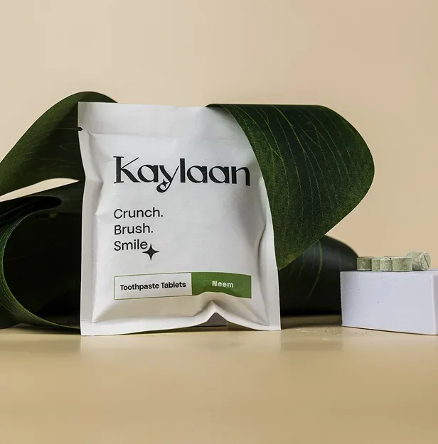
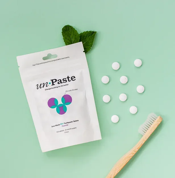
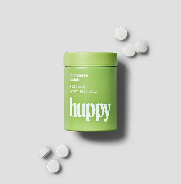
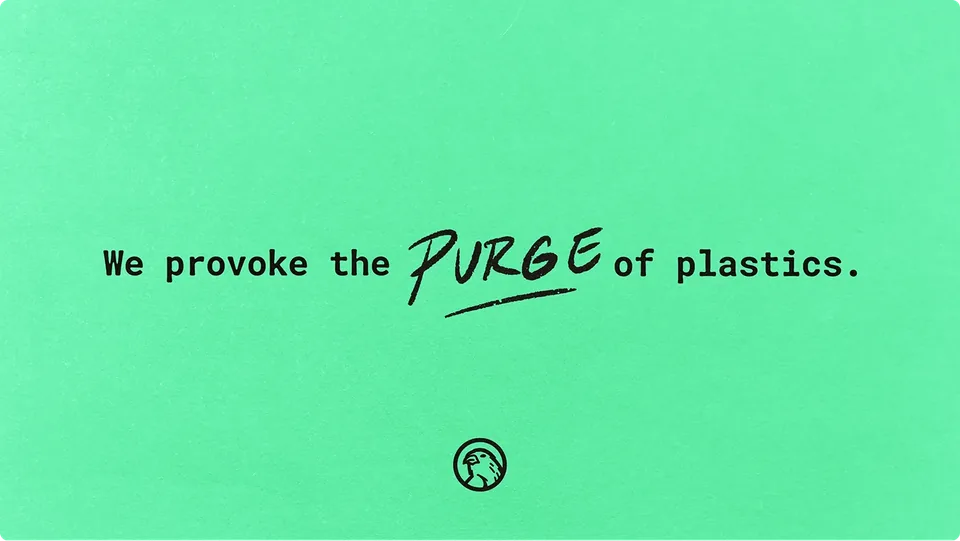
The shift was subtle but important. The enemy was not the consumer. It was plastic. It was wasteful systems that had become normal.
That distinction allowed the brand to carry conviction without judgment.
Subversion became optimism with clarity. Not aggression.


Visual identity
The identity holds tension deliberately.
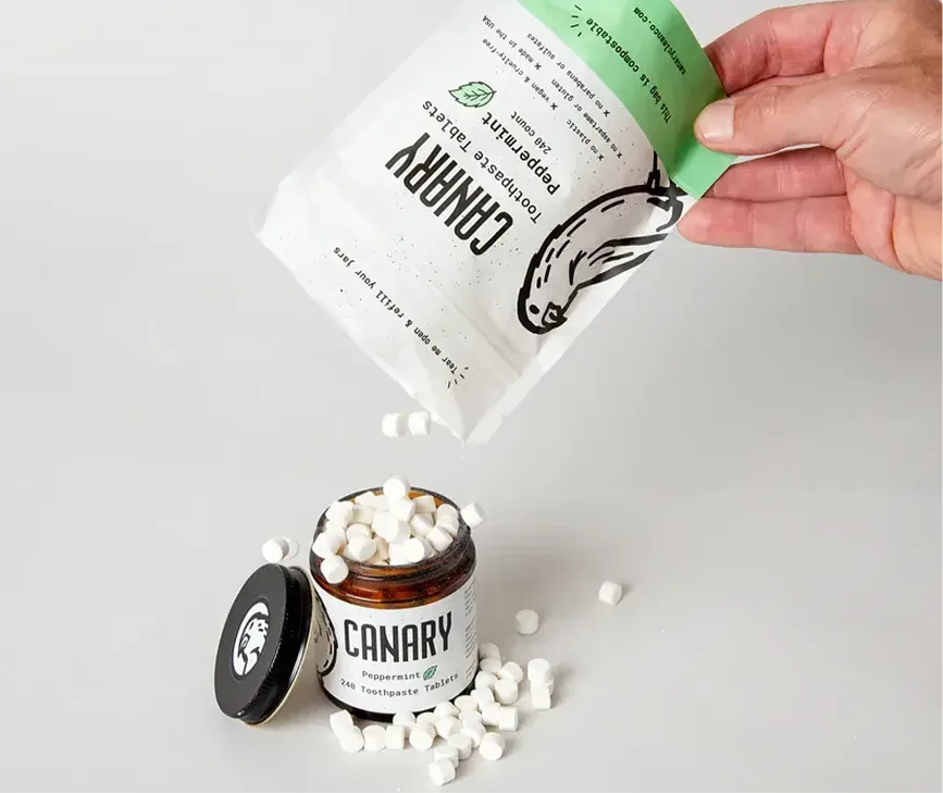
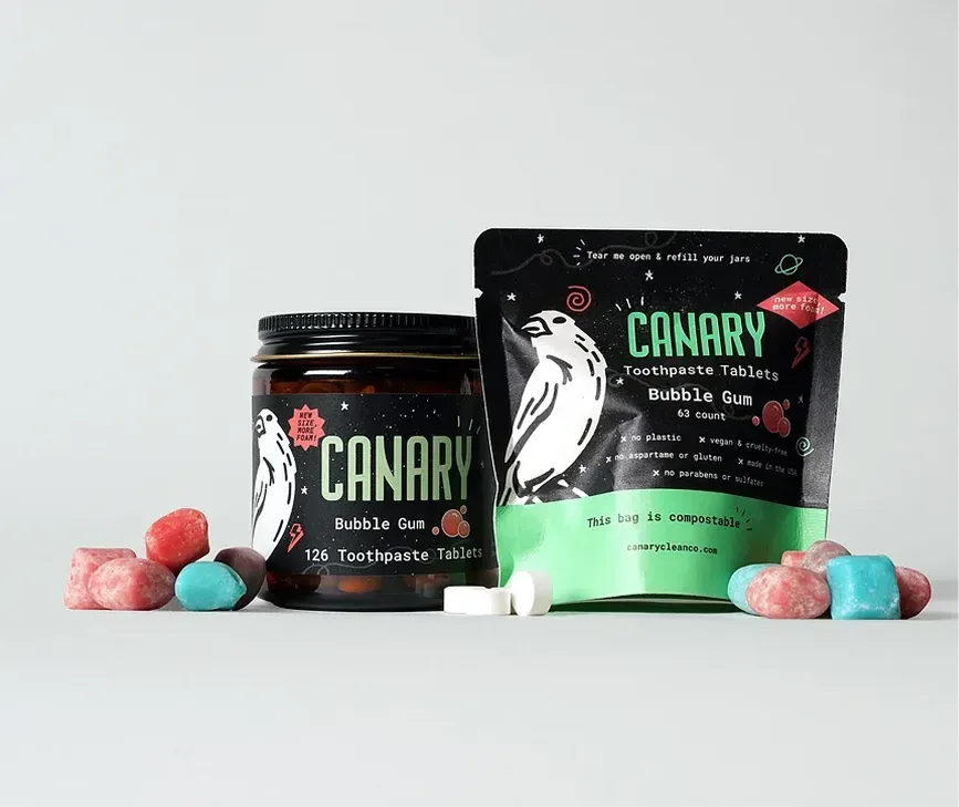
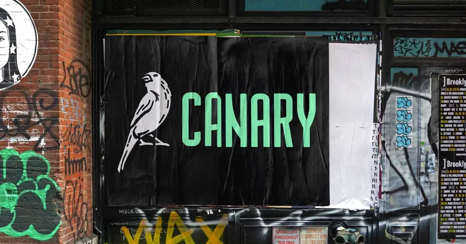
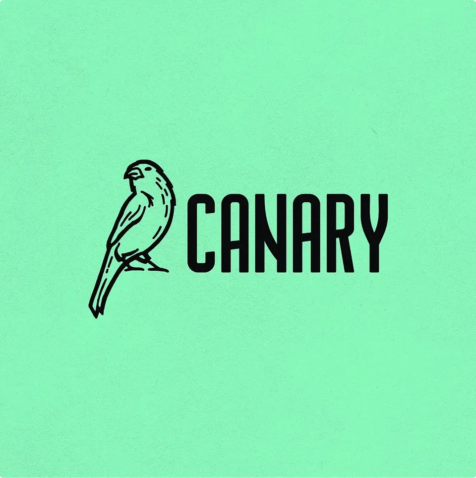
The wordmark is direct and confident. It shows up clearly on shelf. The typography is structured, not delicate. The language is plain about reducing plastic and rethinking habits.
That gives the brand credibility with younger, design-aware consumers who expect brands to stand for something real.
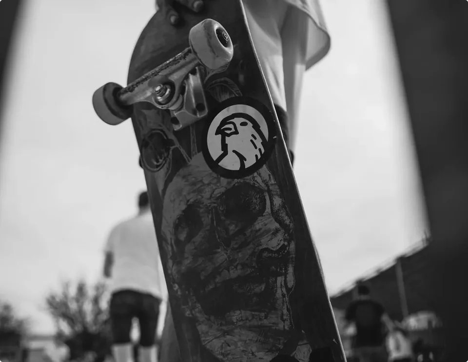
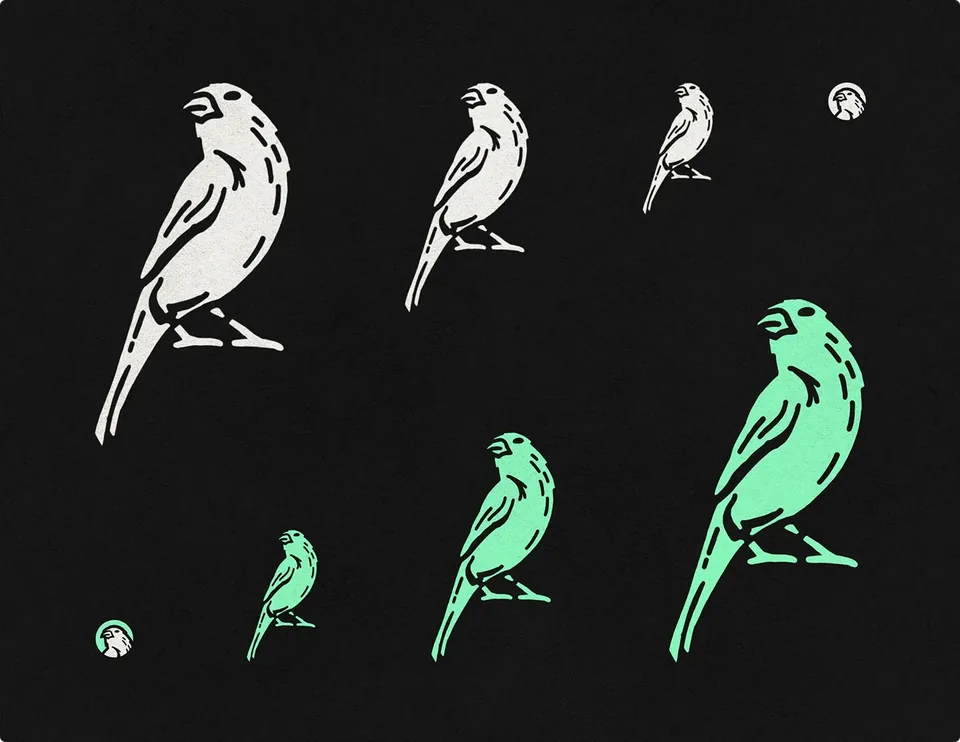
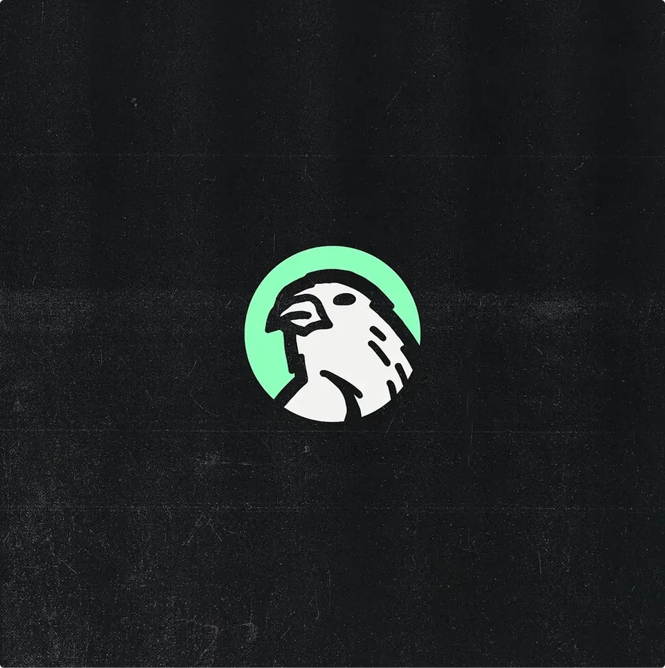
At the same time, the color system is energetic and welcoming. The mascot introduces personality without irony. The tone respects parents and speaks to children without condescension.
Nothing is sarcastic. Nothing is preachy.
Playfulness lives in expression. Conviction lives in stance.
Because those roles are defined, a kid's toothpaste and an adult body product feel like parts of the same point of view.
A system that adapts
The work resulted in a cohesive brand language that moves naturally from product to product.
On shelf, Canary stands apart from the soft neutrals that surround it. In a family bathroom, it feels lively but not chaotic. In social channels, it can speak clearly about waste without shifting tone.
There is range, but there is no drift.
The brand feels intentional because each element plays a defined role. Nothing competes for attention. Nothing feels added for decoration.
The identity does not sit on top of the product. It expresses what the product believes.




The most important work was not choosing colors or type. It was defining what Canary would not become. There were opportunities to lean harder into edge. There were opportunities to soften the work to feel safer. The discipline was in refusing both extremes.
Canary is for real households. But it does not look or sound like a generic household brand. Holding that line required clarity and restraint. It gave Canary confidence in future decisions, not just this launch.
The outcome
At launch, Canary did not blend into the eco aisle.
It felt present. Confident. Engaged.
It works for children and adults. For families and design-conscious young consumers. It carries a clear point of view without feeling exclusive.
The result is a brand that feels deliberate in everyday life. Not loud. Not careful. Just clear.
Let’s talk
and build the brand with care from the start.